Lettering Styles and Cuts
Just a small showcase of some lettering cuts…
*Click on photos for High Resolution*
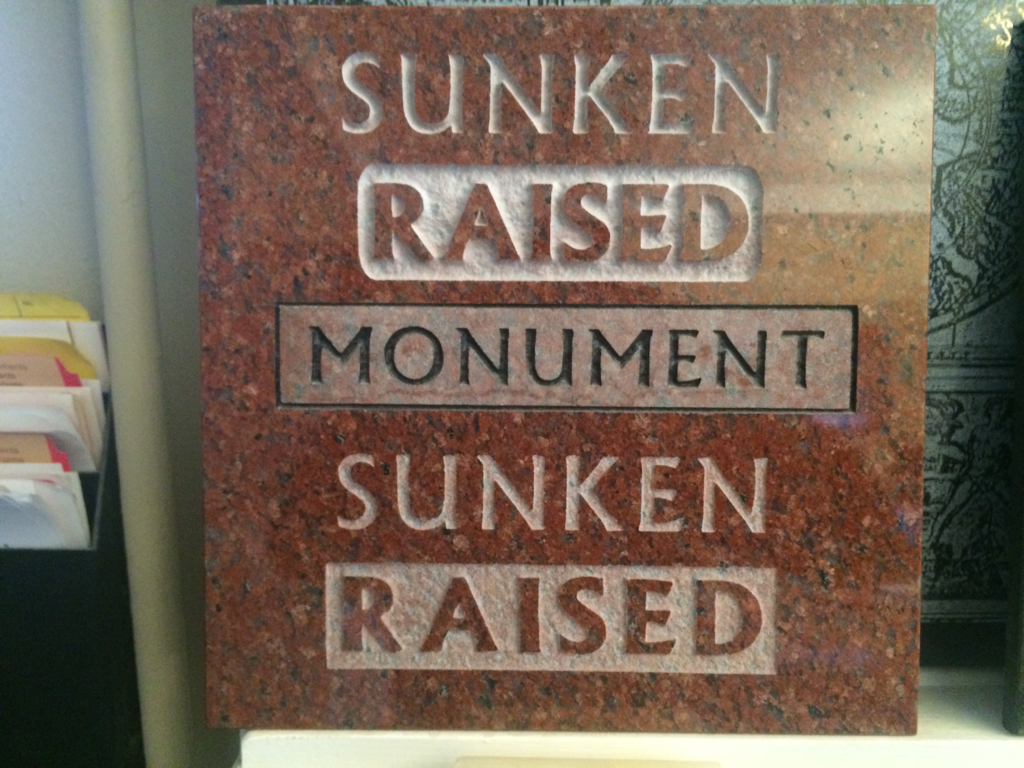
From top to bottom:
- Sunken w/ Hilite – Visible in the rain
- Raised w/ Hilite – Visible in the Rain
- Flash panel w/Hilite – Heavy black – Visible in the rain – Removes significant amount of polish
- Sunken – Natural – Difficult legibility wet
- Raised – Natural – Difficult legibility wet
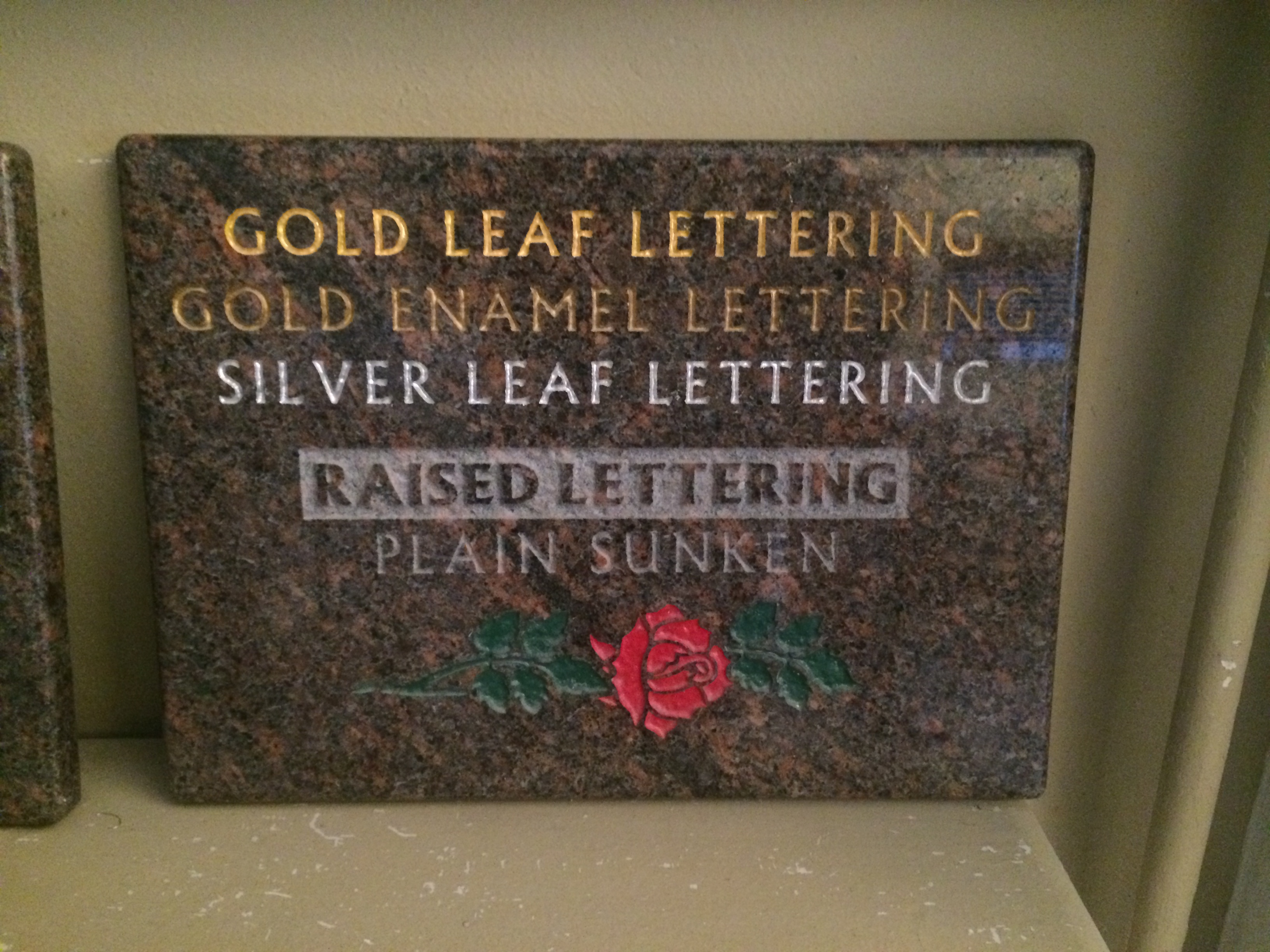
From top to bottom:
- Gold Leaf – 24 karat – Inlaid – 10 to 35 years depending on exposure
- Gold Enamel – Powdered gold applied – 15 years
- Silver Leaf – Anti oxidizing – 25 Years
- Raised paneled lettering -generations – Cleaning after 10-15 years
- Sunken lettering -generations – Cleaning after 10-15 years
- Triple glazed baked enamel – Porcelaining – 35 to 100 years depending on exposure.
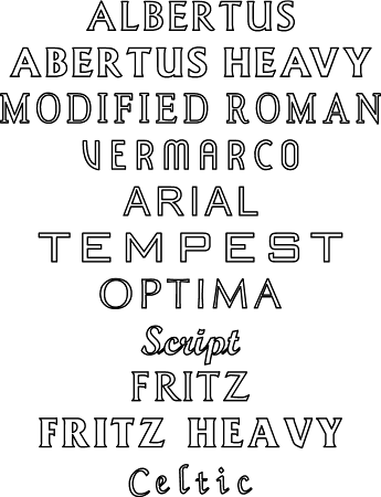
A few examples of some font choices. While the fonts available in the world of computer graphics are limitless it is exceptionally important to choose ones that not only look good in stone but also cut effectively.
We will help guide you in choosing a typeface that suits the stone you choose. Just a small sample of some options below.